Green RPA
Green RPA is a feature that analyses RPA programs for sustainability, by tracking monthly shifts of individual parameters that contribute to higher computer processing and infrastructure. These parameters are tracked at a process, robot and machine level.
Prerequisites:
Ensure that the user role has access to the required Green RPA dashboard page. For more information about assigning the access to the user see Specify Role Access.
To view the Green RPA dashboards:
- Access the Admin portal and login.
- In the left navigation pane, click Green RPA. The Green RPA screen appears.
Following are the available dashboards:
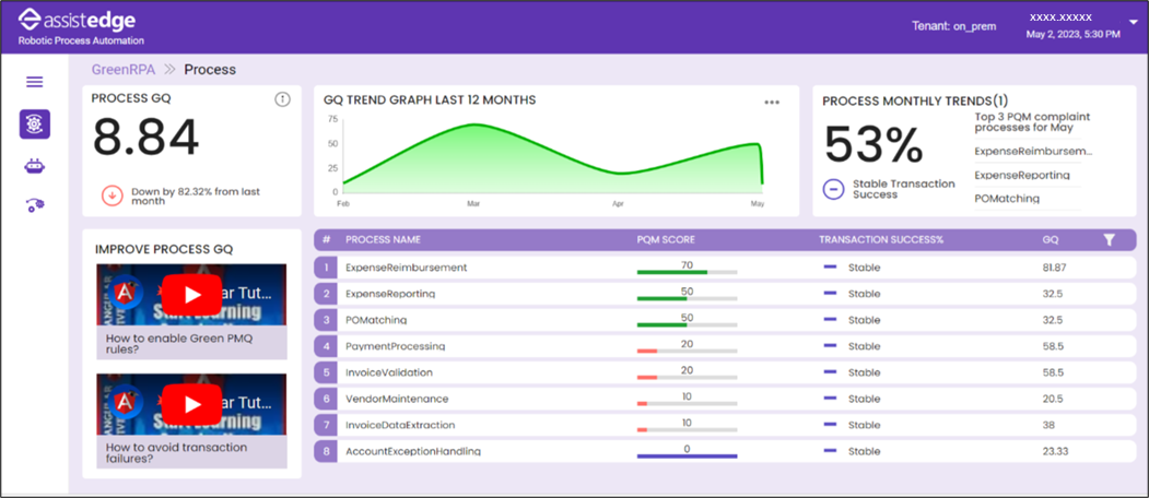
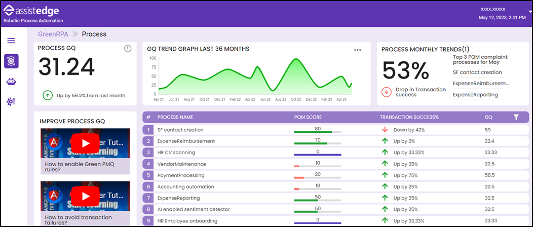
Process GQ Dashboard
The Process GQ dashboard helps the user to view automation processes with regards to sustainability. The dashboard provides statistical trends and gives insights on improvement areas for RPA processes. The statistical data is calculated based on the Process Quality Matrix (PQM) score and the Transaction Success Rate, with 30 % weightage to PQM score and 70 % weightage to Transaction Success Rate.
The dashboard displays data (excluding the GQ Trend Graph), for n-1 days of each month. For example, on the 4th of every month, the dashboard displays data from the 1st to 3rd of that month.
Prerequisites:
To enable the scorecard calculation for the Process GQ dashboard:
- The process must be analyzed, deployed, and executed in the Automation Studio. For more information, see Deploy a Process.
- You must enable the rules on the Rules page, under the Admin menu in Automation Studio. For more information about enabling Rules see Managing Rules. Each rule associated with Green RPA, is assigned a particular weightage, which is used to calculate the PQM score.
The Process GQ dashboard displays the following sections:
- Process GQ: Process GQ is the aggregate, of PQM score and the Transaction Success rate for, all the processes in the organization. Additionally, it displays an arrow formatted rise or reduction in the score from the previous month.
- GQ Trend Graph: This card displays the graph depicting the GQ score, available for past months. Click on the horizontal ellipsis, at the right upper corner of the card, to view the GQ Trend Graph for 12 months, 24 months or 36 months as required.
NOTE:
In case of 24 or 36 months, the graph presents the data in a quarterly format. - Process Monthly Trends: This card displays the transaction success rate change in the current month as compared to the previous month. Additionally, the top three PQM-compliant processes are listed.
- Individual Process GQ Score table: This section displays the PQM score, Transaction Success rate percentage (in comparison to previous month), and GQ score, of the deployed processes, for the current month in comparison to the previous month. You can filter the processes based on PQM score above threshold, PQM score below threshold, transaction success increasing, and transaction success decreasing.
- Videos to Improve Process GQ: This section provides links to videos that can be utilized by users to improve their transaction rate or PQM score for the processes, by using the existing features in AssistEdge.
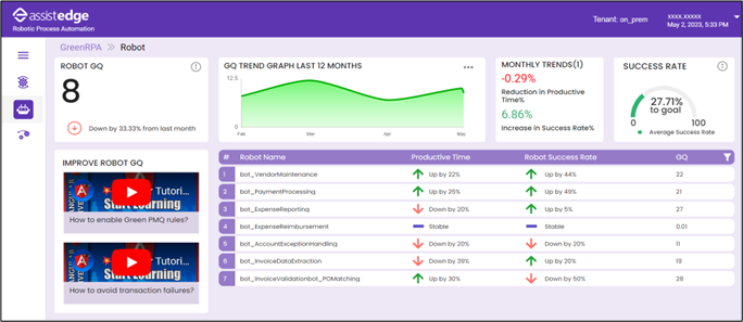
Robot GQ Dashboard
The Robot GQ dashboard helps the user to view the utilization of the Robot with regards to sustainability. The dashboard provides statistical trends and gives insights on improvement areas on Robot utilization. The statistical data of the Robots and Robot Farm is calculated based on data derived from the Robot performance details in Control Tower. For more information see Robot View.
The dashboards displays data for n-1 days of each month. For example, on the 4th of every month, the dashboard displays data from the 1st to 3rd of that month.
The Robot GQ dashboard displays the following sections:
- Robot GQ: Robot GQ is the aggregate score calculated based on the Productive Time and the Success Rate for the rise or reduction in the values from the previous month.
- GQ Trend Graph: This card displays the graph depicting the GQ score, available for past months. Click on the horizontal ellipsis, at the right upper corner of the card, to view the GQ Trend Graph for 12 months, 24 months or 36 months as required.
NOTE:
In case of 24 or 36 months, the graph presents the data in a quarterly format. - Monthly Trends: This section displays the aggregated Robot Productive Time and the Success Rate percentage increase or decrease, in the current month, as compared to the previous month.
- Success Rate: This section displays the aggregate success rate of the Robot farm and indicates successful executions of Robots, across the organization, for the current month.
- Individual Robot GQ Score table: This section displays the Robot’s Productive Time (in comparison to the previous month), Robot Success Rate percentage (in comparison to previous month), and GQ score. You can filter the Robots based on Success Rate Negative Trend, Success Rate Positive Trend, Productive Time Positive Trend, Productive Time Negative.
- Videos to Improve Robot GQ: This section provides links to videos that can be utilized by users to improve their Robot Productive time or the Success Rate.
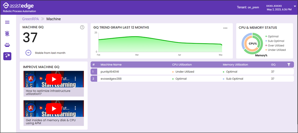
Machine GQ Dashboard
The Machine GQ dashboard helps the user to view the utilization of machines with regards to sustainability. The dashboard provides statistical trends and gives insights on improvement areas on Machine utilization. The statistical data of the Machine CPUs and Memory utilization is calculated based on data derived from the APM Dashboard in Control Tower. For more information see APM Dashboard.
The dashboards displays data for n-1 days of each month. For example on the 4th of every month, the dashboard displays data from the 1st to 3rd of that month.
The Machine GQ dashboard displays the following sections:
- Machine GQ: Machine GQ is the mean of Memory utilization of the machines for the current month. Additionally, it displays a comparison with the Machine GQ from the previous month.
- GQ Trend Graph: This section displays a graph depicting the GQ score, available for past months. Click on the horizontal ellipsis, at the right upper corner of the card, to view the GQ Trend Graph for 12 months, 24 months or 36 months as required.
NOTE:
In case of 24 or 36 months, the graph presents the data in a quarterly format. - CPU & Memory Status: This card displays the CPU and Memory status, of the machines, in a doughnut pie chart format, for the current month, with regards to the whether the status is optimal, suboptimal, over utilized or underutilized.
- Individual Machine GQ Score table: This section displays the CPU Utilization, Memory Utilization and Machine GQ scores for individual machine for the current month. You can filter the processes based on Optimal, SubOptimal, Over Utilzation, Under Utilization.
- Videos to Improve Machine GQ: This section provides links to videos that can be utilized by users to improve their CPU and Memory utilization rate for the machines, by using the existing features in AssistEdge.