Using Process Recorder Activity
1. In the Canvas Tools pane, click Process Recorder. A vertical tray appears on the right-hand side of the screen. Let's first understand the Process Recorder tray.
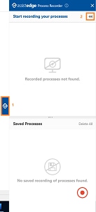
·  (EdgeVerve) - Minimizes the window to the right side of the screen.
·  (Launcher) - Launches the complete process recorder tray. Initially, Start recording your processes and Saved Processes is launched.
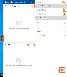
·  (Collapse Settings View) - Minimizes the Available Browsers and the Active Recorders panes.
·  (Start Recording) - Starts the process recorder. The button turns into blue color and displays the pause sign.
§ Click the Pause button to pause the recording. It reverts to red color and displays the play sign.
§ Click the Play button to resume the recording or long hold the button to stop the recording.
·  (Google Chrome) - Click to launch and activate the browser. Once activated, it is listed as an active recorder as depicted for Internet Explorer. The green icon on the right side indicates that the browser is active.
·  (Mozilla Firefox) - Click to launch and activate the browser. Once activated it is listed as an active recorder as depicted for Internet Explorer. The green icon on the right side indicates that the browser is active.
· Saved Processes pane - Displays the list of recorded and saved processes.
· Click Delete all to delete all the saved processes.
· Click X (Close) to close the process recorder tray and go back to the Canvas.
2. Click the  (Start Recording) icon and start recording your process.
|
NOTE: |
Make sure required application for process recording are open on your system in the background before proceeding with the Start Recording. |
3. Click the  (Pause Recording) icon to pause the recording and then click the
  (Start Recording) icon to resume recording, if required.
4. Long hold the  (Stop Recording) button to stop process recording. Recorded Process is available in the Saved Processes pane.
5. Click the  (three dot) icon to view and select the required option. The available options are:
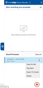
§ Open & Edit - View the recorded process in the Start recording your process section.
§ Play Back - View the entire recorded automation.
§ Export To Studio - Export the recorded process on to the Flowchart designer area on the Canvas.
§ Delete - Delete the recorded process.
· Click Delete All to delete all the saved processes in the process recorder activity.
6. Click Open & Edit to open the recorded process and its step in the Start recording your process section.
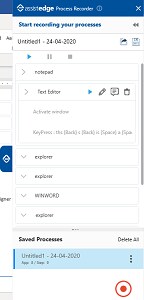
Following are available options/features of Start recording your processes section on the process recorder tray:
· Name Field - Edits the process name.
·  (Save Process) - Saves the changes performed in the recorded steps.
·  (Export To Studio) - Exports the recorded process on the Flowchart designer area on the Canvas.
·  (Arrow) - Expands or collapses the recorded steps.
·  (Play Automation) - Views the automation of the recorded step.
·  (Edit Semantic) - Edits the recorded step name.
·  (Edit Annotation) - Adds a footnote for the recorded step.
·  (Delete) - Deletes the recorded step.
7. Click the  (Export To Studio) icon to export the recorded process on to the Flowchart designer area on the Canvas.
8. The Application Mapping window appears. In this window, you need to map the Captured Application window to the Target Application window.
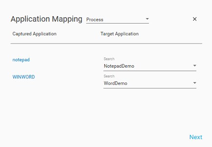
a. Select the Application Mapping type from the list. There are three types of application mapping:
§ Process - Automation process workflow in Automation Studio forms the workflow where you can design a process you want to automate.
§ SignIn Process - A sign in process (also known as a log in process) is used to access an application upon authentication. In a typical scenario, a username and password are required to sign in to an application. You can use a SignIn Process to automate the repetitive task of signing in to an application.
§ Reset Process - With the help of a reset process, you can change the current state of the application involved in your process to the initial state of it.
b. Map the Captured Application to the Target Application.
c. Click Next.
9. The Field Mapping window appears. In this window, you need to map the arguments/parameters to the Name Field.
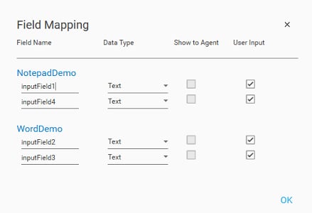
a. Name Field: You can edit the Field Name as per your requirement.
b. Data Type: Select the Data Type for Field Name from the list.
§ Text – Select this if field names input is in string/text. For example, Student Name, Applicant Name.
§ Numeric – Select this if field name input is in whole number. For example, 6, 45.
§ Decimal – Select this if field name input is in decimal number. For example, 7.89, 1.34.
§ Boolean – Select this if field name input is either true or false.
§ TableData – Select this if field name input is in tabledata format.
§ DataTable – Select this if field name input is in datatable format.
§ DateTime – Select this if field name input is in date and time format.
c. Show to Agent: This option is selected when argument is copied while recording.
d. User Input: This option is selected when argument is typed or pasted while recording.
10. Click OK.
11. The recorded process is exported on the Flowchart designer area on the Canvas.
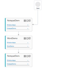
12. Additionally, you can view the configuration of the recorded steps and perform changes in the configuration as per your requirement to get the desired results. Double-click any exported application to drill down the steps.
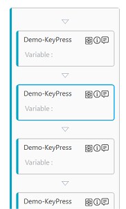
13. Click the  (Settings) icon to make changes in the captured interaction. In the Action list, you can change the type of the action on the recorder interaction. The Field Properties and Misc Properties may vary as per the selected action on the recorded interaction. Refer Web Mode Properties and Windows Mode Properties, for Control Behavior, Field Properties and Misc Properties for more details.
|
NOTE: |
You can configure any new interaction in the process recorder activity without performing re-recording of the business process. See Web Application and Windows Application for more details. |
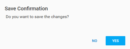
14. Click the X (Close) icon. A confirmation message appears.
15. Click YES to save the changes.
Web Mode Properties
The properties of Web Mode are listed in the following table:
|
Property Name |
Usage |
||
|
Control Behavior |
|||
|
Action |
In the Action list, Select the Interaction. · Control Exists - Checks if the UI element exists at the required area. It is useful when working with dynamics controls. · Wait Until Exists - Waits till the UI element is found. Using this action avoids usage of delay in between the activity to address page loading time. This interaction returns a Boolean value of true or false on success or failure of finding the image. The Boolean value can be set to a variable and checked in a conditional statement to perform an appropriate action after finding the image. · Click - Allows to left click the selected UI element. · Open Context Menu - Use this option, in case the control opens a context menu on click. · Double Click - Performs a double clicks the selected UI element. · Get Value - Extracts the current value of the selected UI element such as, value of an input field , text box or selected area. · Get Attribute - Extracts the value of the attribute of the selected UI element. · Get Text - Extracts the value of the attribute of the selected UI element. · Mouse Over - Hovers the mouse over the selected UI element. · Scroll By - Scrolls to particular section of the web page horizontally or vertically. · Scroll Into View - Scrolls to bring the application area viewable on screen of the web browser. · Set Value - Sets the user provided value of the attribute of the UI element and stores it as the value of the parameter. You must define the parameter in the Parameter bar before you start capturing the element. · Set Attribute - Sets the user provided attribute for the specified UI element and stores the provided value of the attribute into a parameter. You must define the parameter in the Parameter bar before you start capturing the element. · Send Keys - Captures UI element input from the keyboard in the selected UI element. The input can be a combination of keys or text input from the keyboard. Use this option when a keystroke needs to be automated on a specific web element and not on the overall application. · Shift Click - Opens the selected URL in a new window. It appears only when you want to capture action on a button or a link. |
||
|
Interaction |
The corresponding interaction set against the selected action. |
||
|
Appears if Action selected is Scroll By. |
|||
|
XAxis |
Vertical scroll on the web page. The value must be entered in pixels. |
||
|
YAxis |
Horizontal scroll on the web page. The value must be entered in pixels. |
||
|
Appears if Action selected is Scroll Into View. |
|||
|
Scroll To |
Determines the area till where the scroll must be done. Available options are: · Start · Center · End
|
||
|
Appears if Action selected is Set Value, Set Attribute or Get Attribute. |
|||
|
Attribute Name |
Sub attributes or the properties of the html attribute selected. |
||
|
Clear Existing Data |
Select this option to clear the existing value. |
||
|
Appears if Action selected is Set Value, Set Attribute. |
|||
|
Input Source |
The input value that must be provided. You must define a parameter in the Parameter bar to use this option. Select the checkbox beside Input Source and enter the input value, if you want to set a default value. |
||
|
Appears if Action selected is SendKeys. |
|||
|
Keys |
The key sent as input from the keyboard. It can be a combination of keys or a text. To configure the keys: 1. Once Action selected is SendKeys, click the
2. In the Select Funtion Keys(Max 3) list, select the keys from the keyboard to create the key combination. You can select upto maximum of three keys. 3. In the Input Key(optional) filed, enter an alphabetical or a numeric key to create the combination. This is an optional field. 4. Click CONFIRM. The configuration for SendKeys action is done. |
||
|
Appears if Action selected is Shift Click. |
|||
|
Dock Window |
When a new browser window is opened on click of a link or a button on the web page, this button enables the new window listed in the multimodal UI. You can select one of the windows in the multimodal UI to configure controls on the intended window. |
||
|
Tab Name |
Name of the new window when it is docked in Engage application. |
||
|
Target URL |
URL of the new window that opens when Shift Click is selected in Action. |
||
|
Field Description |
|||
|
Control Tag |
User specified identifier of the selected UI element. |
||
|
Control Type |
Type of the UI element selected. |
||
|
Display Name |
User specified display name of the action configured. |
||
|
Find By |
Locator of the UI element on a web application. Identifying the correct element forms one of the first step towards creating an automation workflow. Available options are:
· Id - Identifier of the UI element. It is useful for locating elements that has a unique Id associated with it. · name - Field name of the control. Each element on the web page has a name assigned to it which can be used to select the intended element. · css3selector - Part of the CSS rule that uses selectors such as tags, class, pseudo-element, pseudo-class, combination of selectors and other wide range of selectors to identify the UI element. · css3xpath - Depending on the html tagging, css3xpath can also be available in this list. It uses the Xpath expression to locate the UI element. · manual - Provides manual way of identifying the UI element. · innertext - Depending on the html tagging, css3xpath can also be available in this list. It returns the text content of the UI element and its descendants. It can be used with the elements that have a dynamic Id, name, or selector but its property value remains deterministic. Some of the examples of innerext values are, Search, *Search, *Search* and Search* that is equivalent to equals, starts with, contains and, ends with respectively. · sclocator - This option is available if an application is automated having Smart Google Web Toolkit (GWT) platform. Support for sclocator is available in Selenium based plugins viz. InternetExplorerSelenium, Chrome, and Firefox. · shadow-path - This options is available if an application is automated having a Shadow DOM. You can configure backup selectors to avoid situations where the automation process is unable to find the primary selector. This is not a mandatory step. Follow the instructions to configure the backup selectors: 1. Click the
2. Select the additional selectors. · If the selector is manual:
a. Click the
b. In the Select Attribute list, select the attribute of the manual selector, Available options are- class, offset and loopselectorgenerated. c. In the Value list, either select a parameter containing the value of the selected attribute or select the check box to set a default value. d. In the Condition list, select the condition of the selector. Available options are- Equals, Contains, Starts With and Ends With. e. The Generated Selector field displays the default value generated, if any. You can click Add to add this value in the Selector field. f. In the Selector list, enter the value of the manual selector. g. Click CONFIRM. 3. In the Value field enter the required query. 4. Drag the selector and drop it to change the sequence, if required. 5. Click CONFIRM to save the configuration. |
||
|
Appears if Action selected is Control Exists, Wait Until Exists, Get Value, Get Attribute, Get Text. |
|||
|
Is C-View |
Is applicable only for AssistEdge Engage. If selected, the field configuration captured in Automation Studio is visible in the Engage C-View tab. |
||
|
Tab Number |
The window tab on which you want to perform automation. |
||
|
Variable Name |
User defined name of the variable that stores the captured value. |
||
|
Variable Type |
Type of the variable defined. Available options are: · Text - A sequence of character, either as a constant or a variable. · Numeric - An integer type that range from negative through positive. · Decimal - An exact numeric value defined by its precision and scale. · Boolean - A data type used for making decision. Can have only two values- true or false. · Data Table - A data type that stores tabular data. |
||
|
Misc Properties |
|||
|
FrameNo |
Number of the frame in a web page where you want to perform the action. Automation Studio automatically detects the frame number based on the area selected during configuration. |
||
|
Item Index |
Index number of the selected item on the web page. |
||
|
Item Offset |
The distance between the target item and the anchor. |
||
 (Configure) icon. The
 _01_th.png)
_01.png)
 (Configure) icon. The
 _02_th.png)
_03_th.png)
 (pencil) icon to configure the manual selector. The
 _04_th.png)
Windows Mode Properties
The properties of Windows Mode are listed in the following table:
|
Property Name |
Usage |
|
Control Behavior |
|
|
Action |
In the Action list, Select the Interaction. · Click - Allows to left click the selected UI element. · Select - Selects a UI element. · Get Text - retrieves text from the selected UI element. · Set Text - sets user provided text input to the selected UI element and stores it into a parameter. You must define the parameter in the Parameter bar before you start capturing the UI element. · Get Data From Table - Reads complete data of a DataGrid Table control to a DataTable and then if required to an excel/CSV file. Following are the steps involved to read the data. a. Create an argument of type System.Data.DataTable, before extracting the UI element. b. Click WINDOWS MODE to extract the Data Grid Table control. c. Select Get Data from the Table. d. Set the Variable Name as the argument created in the first step. e. Save the configuration. f. Use Export Data Table activity to write data to excel · Select Tree Node - Selects a node of a tree control using this interaction. Specify the input in a specific format. For example, for selecting node 1.1, enter the input value as Number/1/1.1.
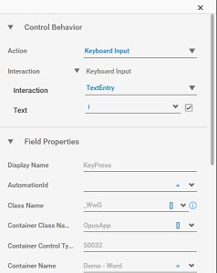
· Expand Tree Node - Expands a node of the tree control. · Select RadioButton – Selects a radio button using this interaction. · Get RadioButton Status - Fetches the radio button status. It returns true or false. · Get ComboBox Value - Reads the currently selected combo box value. · Perform Combobox Select Value - Selects the specified value from the drop-down list. · Expand/Collapse - Allows to expand or collapse the selected UI element. · Toggle CheckBox Action - Toggles the current state of a checkbox. · Get CheckBox Status - Returns the current selection status of a checkbox. · Set DataGrid Value By Index - Sets the value to a DataGrid cell based on its index. · Get DataGrid Value By Index - Retrieves data grid value by its index. Specify the cell index from which the input is needed. · Scroll Horizontal - Performs horizontal scroll based on the input provided on the percentage scale from 0 to 100. · Scroll Vertical - Performs vertical scroll based on the input provided on the percentage scale from 0 to 100. · Mouse Click - allows mouse simulation. It requires the application to be in focus. You can choose to perform Left Click, Right Click or Double Click available from the drop-down list. · Keyboard Input - captures UI element input from the keyboard in the selected UI element. This interaction allows performing different keyboard input combinations with the help of Single Key, Double Keys, and Triple Keys and TextEntry options. · Set Focus - brings the UI element in focus before performing any action on it. · If Control Exists - checks availability of the UI element on the windows application. It is used while working with dynamic controls. · Legacy Interaction - This action helps in configuring controls in Windows applications which support a legacy pattern. |
|
Interaction |
The corresponding interaction set against the selected action. |
|
Appears if Action selected is Horizontal Scroll or Vertical Scroll. |
|
|
Expand/Collapse |
Performs horizontal/vertical scroll based on the input provided on the percentage scale from 0 to 100. |
|
Percent |
Allows to expand or collapse the selected UI element. |
|
Appears if Action selected is Keyboard Input and Interaction selected is TextEntry. |
|
|
Text |
Allows user input as a text. |
|
Appears if Action selected is Mouse Click. |
|
|
Mouse Action |
Allows user input using the mouse. Available options are: · LeftClick - Performs a left click specified at the offset point. · DoubleClick - Performs a double click specified at the offset point. · RightClick - Performs a right click specified at the offset point. |
|
Appears if Action selected is Get DataGrid Value by Index or Set DataGrid Value By Index. |
|
|
Column Number |
Specify the cell index from which the input is needed. |
|
Row Number |
Specify the cell index from which the input is needed. |
|
Appears if Action selected is Keyboard Input and Interaction selected is DoubleKeys or TripleKeys. |
|
|
Key |
The single key set as input from the keyboard. |
|
Key |
The second key that is set as input from the keyboard along with the first key. |
|
Key |
The third key that is set as input from the keyboard along with the first and the second key. |
|
Field Description |
|
|
Display Name |
User specified display name of the windows element selected. |
|
AutomationId |
Unique identifier for the automation element in the automation tree. See Handling Dynamic Controls section to know more about the usage of this field. |
|
Class Name |
The class name of the UI element as defined by the UI element developer. See Handling Dynamic Controls section to know more about the usage of this field. |
|
Container Class Name |
The container class name of the UI element as defined by the developer. See Handling Dynamic Controls section to know more about the usage of this field. |
|
Container Control Type |
The control type of the container of the UI element as defined by the UI element developer. |
|
Container Name |
The container name of the UI element as defined by the developer. See Handling Dynamic Controls section to know more about the usage of this field. |
|
Control Index |
The index of the current UI element within the entire set of elements with the same values of automation Id, class name and UI element name as that of the current element. |
|
Control Name |
The control name of the UI element as defined by the UI element developer. See Handling Dynamic Controls section to know more about the usage of this field. |
|
Control Type |
The control type of the UI element as defined by the developer. |
|
Search By Control Order No. |
Signifies if the UI element needs to be searched based on the UI element order number. Control order number is the index of the current element within the entire set of elements with the same value of UI element Id as that of the current element. |
|
Control Order No. |
Control order number is the index of the current element within the entire set of elements with the same value of UI element Id as that of the current element. |
|
Is applicable only for AssistEdge Engage. Appears if Action selected is If Control Exist. |
|
|
Is C-View |
If selected, the field configuration captured in Automation Studio is visible in the C-View tab of Engage application. |
|
Appears if Action selected is Get Text. |
|
|
Variable Name |
User defined name of the variable that stores the captured value. |
|
Variable Type |
Type of the variable defined. Available options are: · Text - A sequence of character, either as a constant or a variable. · Numeric - An integer type that range from negative through positive. · Decimal - An exact numeric value defined by its precision and scale. · Boolean - A data type used for making decision. Can have only two values- true or false. · Data Table - A data type that stores tabular data. |
|
Appears if Action selected is Mouse Click. |
|
|
Offset From Control |
It is the distance between the UI element and the anchor. |
|
Misc Properties |
|
|
Max wait for input idle |
The maximum time interval in milliseconds for which the windows plugin waits on launch before it starts executing the configured interactions. |
|
Retry Count |
Number of times, the plugin retries to find a UI element, if not found. |
|
Retry Interval (ms) |
The time interval in milliseconds for which the plugin waits before it attempts for a retry. |
_01_th.png)
Process Recorder Properties
The properties of Process Recorder activity are listed in the following table and can be edited in the Properties grid on the right pane.
|
Property Name |
Usage |
|
Control Execution |
|
|
Ignore Error |
When this option is set to Yes, the application ignores any error while executing the activity. If set to NA, it bypasses the exception (if any) to let the automation flow continue; however, it marks the automation status as failure, in case of an exception. By default, this option is set to No. |
|
Delay |
|
|
Wait After (ms) |
Specify the time delay that must occur after the activity is executed. The value must be in milliseconds. |
|
Wait Before (ms) |
Specify the time delay that must occur before the activity is executed. The value must be in milliseconds. |
|
Misc |
|
|
Breakpoint |
Select this option to mark this activity as the pause point while debugging the process. At this point, the process freezes during execution allowing you to examine if the process is functioning as expected. In large or complex processes, breakpoints help in identifying the error, if any. |
|
Commented |
Select this option to mark this activity as inactive in the entire process. When an activity is commented, it is ignored during the process execution. |
|
DisplayName |
The display name of the activity in the flowchart designer area. By default, the name is set as Target Application Name. You can change the name as required. |
Handling Dynamic Controls
Automation Studio provides different identification criteria and Parametrization of the value of the dynamic field properties of the UI elements. You can reconfigure some of the auto captured field properties of such UI elements to create a more effective way of identifying the indented UI element. For such controls, remove the dynamic part of the string and use an appropriate option for UI element identification. For example, if a Class Name field is recognized as AssistEdge_Studio_20180205083009, the later part of the string, that is a timestamp, is dynamic and can be removed. Retain only the static part and reconfigure the field properties using the suitable option.
Following are the different field properties that can be reconfigured against their respective values:
· AutomationId
· Class Name
· Container Class Name
· Container Name
· Control Name
_01_th.png)
Use the  (drop down arrow) to reconfigure the identification criteria. Available options are:
· Equals - Identifies the UI element based on the exact match with the value of the selected field property.
· Contains - Identifies the UI element based on the string present in the value of the selected field property.
· StartsWith - Identifies the UI element based on the starting string of the value of the selected field property.
· EndsWith - Identifies the UI element based on the ending string of the value of the selected field property.
· Regex - Identifies the UI element with the string matching the value of the selected field property as per the identification pattern defined through the provided regular expression such as a.b, *txt and others.
· Variable - Identifies the UI element as per the parametrization of the value of the selected field property. Parametrization allows to run the identification process over and over again using different values. With parameterization, windows controls with looping and assignment activities, are used.
Related Topics