Introduction
The section is the placeholder to hold Form Elements.
Each section has one column in it by default.
Get Started
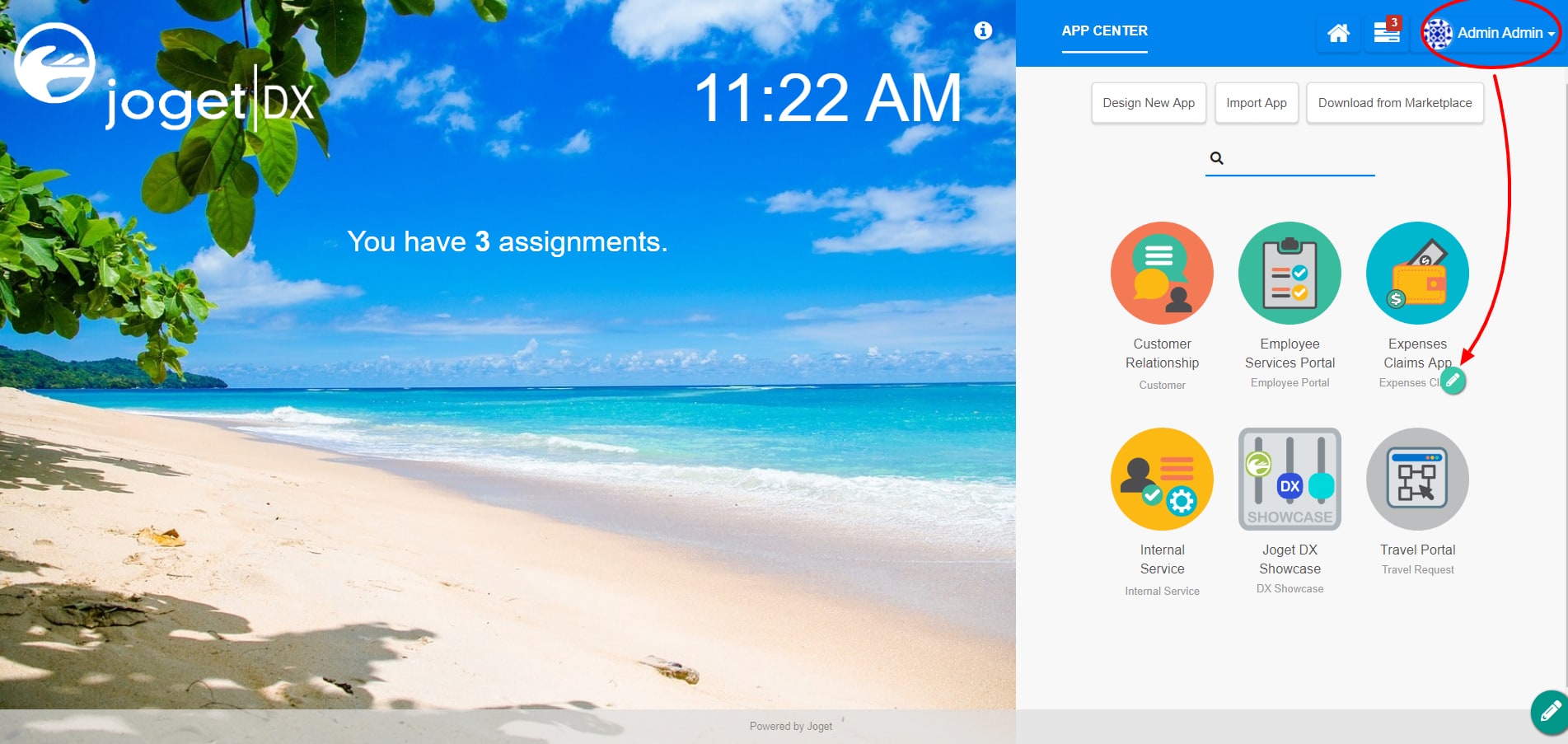
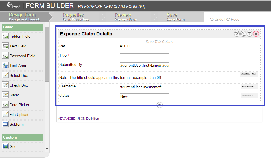
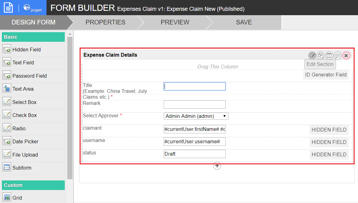
To see how Section works, the default bundled Expenses Claims app will be used for this example.
| Steps | Screens (Click to view) |
|---|---|
|
Figure 1
Figure 2 |
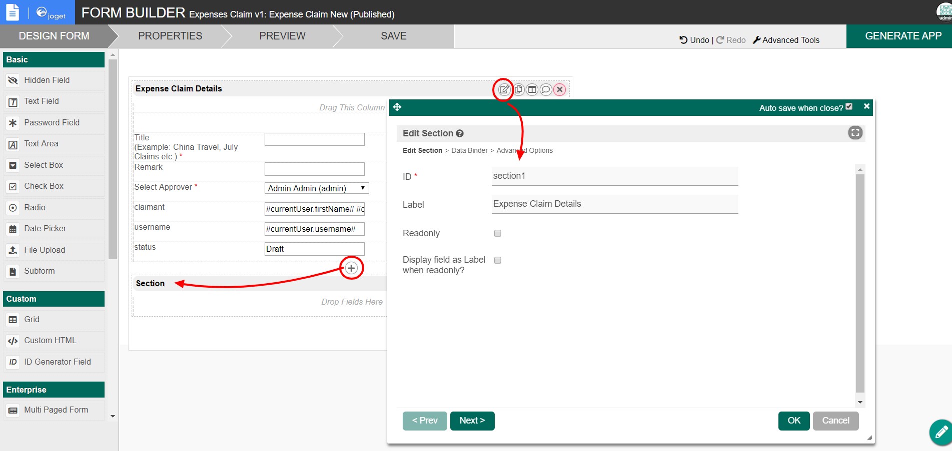
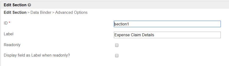
Section Properties
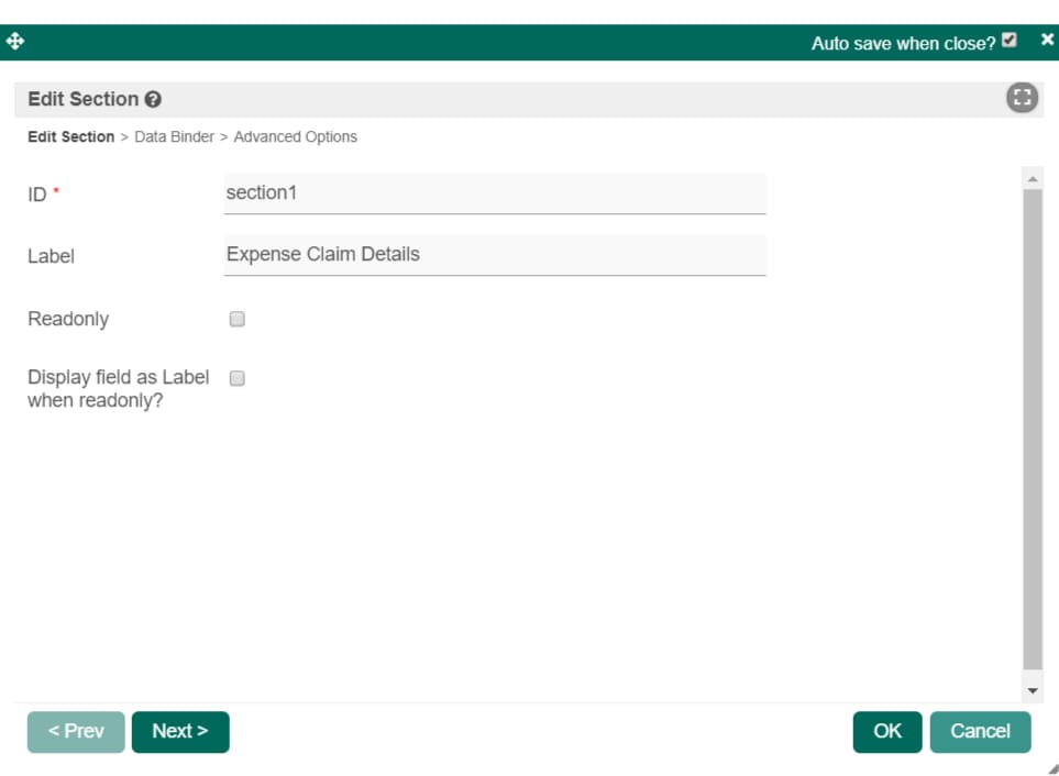
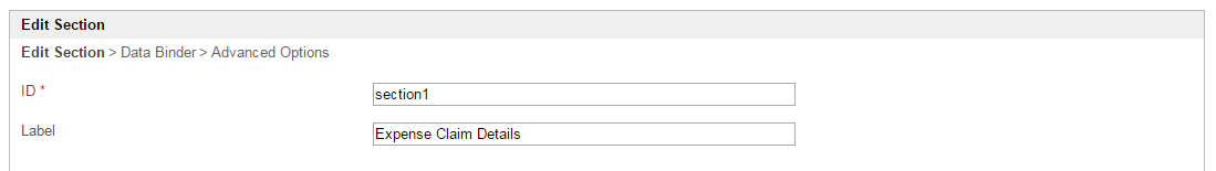
Edit Section
| Name | Description | Screen (Click to view) |
|---|---|---|
| ID | Element ID. Since the section is not an input field, it is optional to change this. Please see Form Element for more information about defining the ID and list of reserved IDs. |
Figure 3 |
| Label | Section label. | |
| Readonly | Determines if the element is editable. | |
| Display field as Label when readonly? | Displays the value of the element as plain text when an element is set to "Readonly". |
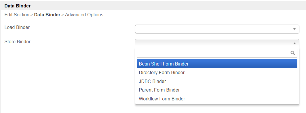
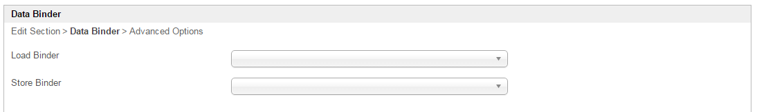
Data Binder
| Name | Description | Screen (Click to view) |
|---|---|---|
| Load Binder | Optional by default. When it is not set, it will use the parent's binder. You may override this behavior by using its own designated binder by defining it. |
Figure 4 |
| Store Binder | Optional by default. When it is not set, it will use the parent's binder. You may override this behavior by using its own designated binder by defining it. |
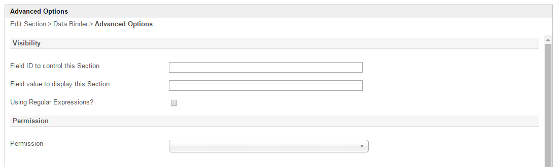
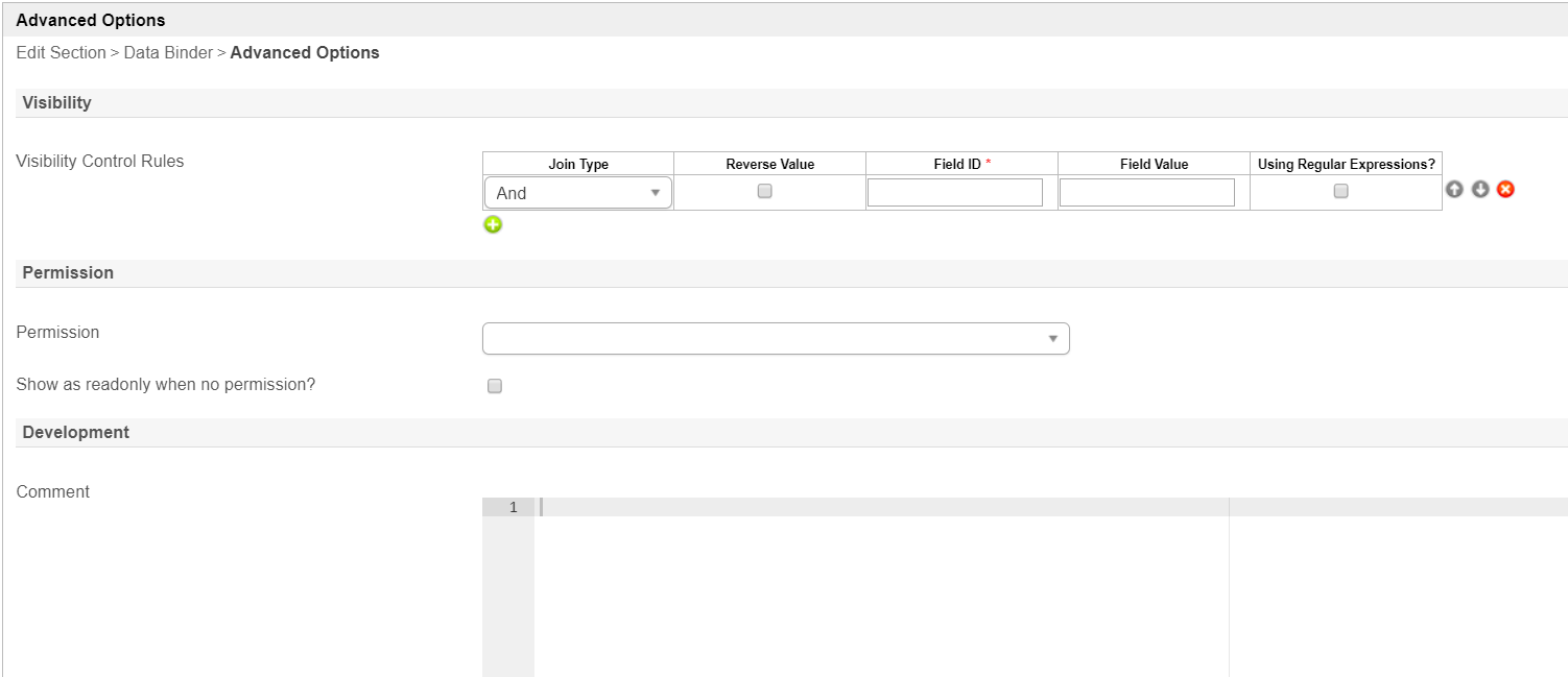
Advanced Options
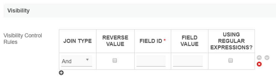
Visibility
| Name | Description | Screen (Click to view) | ||||||||||||
|---|---|---|---|---|---|---|---|---|---|---|---|---|---|---|
| Visibility Control Rules |
|
Figure 5 |
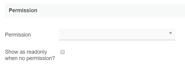
Permission
| Name | Description | Screen (Click to view) |
|---|---|---|
| Permission | Manage the permission on who to see this section. See Permission Control. |
Figure 6 |
| Show as readonly when no permission? | Displays the value of the element as plain text when a user's permission is denied. |
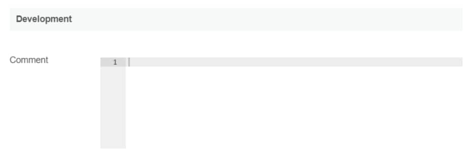
Development
| Name | Description | Screen (Click to view) |
|---|---|---|
| Comment | Appends a helper text beside this section when in the form builder, to help app designers identify the section. |
Figure 7 |
Download Demo App
Attachments:
 Screenshot 2015-08-14 18.06.39.png (image/png)
 screencapture-localhost-8080-jw-web-console-app-hr_expense-1-form-builder-hr_expense_new-1439546850087.png (image/png)
 screencapture-localhost-8080-jw-web-console-app-hr_expense-1-form-builder-hr_expense_new-1439546842165.png (image/png)
 screencapture-localhost-8080-jw-web-console-app-hr_expense-1-form-builder-hr_expense_new-1439546858362.png (image/png)
 figure 1.PNG (image/png)
 figure 2.PNG (image/png)
 figure 3.PNG (image/png)
figure 4.PNG (image/png)
figure 3.PNG (image/png)
figure 4.PNG (image/png)
 advgrid_step1.png (image/png)
step2.png (image/png)
properties.png (image/png)
properties_adv_de.png (image/png)
properties_adv_permission.png (image/png)
properties_adv_visibility.png (image/png)
APP_booleanTest-sample.jwa (application/octet-stream)
APP_booleanTest-sample.jwa (application/octet-stream)
advgrid_step1.png (image/png)
step2.png (image/png)
properties.png (image/png)
properties_adv_de.png (image/png)
properties_adv_permission.png (image/png)
properties_adv_visibility.png (image/png)
APP_booleanTest-sample.jwa (application/octet-stream)
APP_booleanTest-sample.jwa (application/octet-stream)