> Blogs > Digital Empathy for the Color Blind
Digital Empathy for the Color Blind

Digital Empathy for the Color Blind
“Blue is the richest color for me” Mark Zuckerberg told The New Yorker.
“I can see all of blue.”
According to The New Yorker, Zuckerberg is red-green colorblind. The color he sees best is blue.
What does this mean?
Zuckerberg can see things as clearly as other people; however, he is unable to fully see red or green light.
We now know why blue happens to be the color that dominates the Facebook website and mobile app!!!

What is color blindness? Does it impact one’s ability to perceive colors?
I got curious to understand it further.
Color blindness or Color vision deficiency is the reduced ability of human eye to distinguish between shades of certain colors, mostly red or green or sometimes blue and yellow.
The below is an image of kite perceived in normal vision vs. color blind vision.

One can observe that the visual palette for a color blind does not perceive red and green as distinct colors.
This poses challenges in multiple spheres of daily life where indications are based on colors, for example traffic lights, reading maps, buying clothes.… the list is long!
Imagine how Facebook would appear to its CEO if it was red or green!
I googled to understand more.
Google! Does it ring a bell?
Google logo is heavy on colors!
My instant thought was how a color blind would perceive this logo. And here it is…

Google logo perceived by a person with normal vision.

Google logo perceived in case of less sensitivity to Red
(Protanopia)

Google logo perceived in case of less sensitivity to Green
(Deuteranopia)

Google logo perceived in case of less sensitivity to Blue
(Tritanopia)
(Image source)
That is the Google logo perceived by color blind eye based on the degree of sensitivity to colors!
Statistics reveal that color blindness affects 8% of males and 0.5% of females globally.
This means that about 8 out of every 100 visitors to a website or an app may not be viewing or experiencing the information and color-based indications as they are meant to be.
Being a banker by profession, I pondered on the many color blind customers who access the digital channels or apps for performing the banking transactions.
My reading led me to understand that banks can adopt holistic and inclusive design practices that are color-blind-friendly and provide a common user experience.
Given below are few good design practices (not exhaustive) gleaned from my reading and experience.
Supplement colors with symbols and text
The image below provides dashboard view of the total expenses incurred by a customer for a period based on transactions in the bank account.
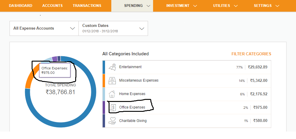
The bank has provided symbols and descriptive text against every colored legend. The customer can hover on any particular color in the chart to understand the category with value. Additionally, textures and patterns in graphs would be even better!
Use text along with colors for alert messaging
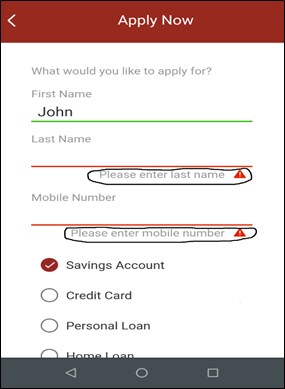
The image depicted on the left is for applying for saving account using mobile banking app. Here green line indicates a successful entry and red calls for the attention of the customer to input data.
A color blind customer may not recognize the color of lines; however, the supporting text signals an alert for input of required data.
Avoid problematic color combinations
Certain color combinations such as red and green, green and brown, green and grey, are a nightmare to the color blind. Avoid using these combinations while designing websites as it gets hard to interpret the information.
Use color blind simulators
There are color blind simulators (e.g. Color Oracle) using which designers can perceive how a color blind will experience the design.
Integrate with bot
Banks can integrate their digital platform with voice assisted bots or chatbots that guide and help accomplish tasks or fetch information with natural language.
Design for accessibility
The Web Content Accessibility Guidelines 2.0. laid out by the World Wide Web consortium lists the guidelines for users to access and use web content equally.
A few banking websites such as Bank of America (Source), HSBC private banking (Source), J P Morgan (Source), also have a webpage dedicated to accessibility.
My final thoughts
There has been a rising influence of digital in banking and financial services.
The global mobile banking report published by KPMG with UBS evidence lab, reveals the number of mobile banking users globally is forecast to double to 1.8 billion over the next four years.
One can deduce the proportion of color blind customers accessing banking channels in this overall number based on global statistics.
It is imperative that design teams at banks are cognizant of the challenges faced by color blind people. Every customer counts. A frustrating experience can lead to lost conversion and sale.
So what if there are problematic color combinations that need to be excluded?
There are a lot more colors on the palette that can drive creativity yet foster accessibility!!
References:
Related Blogs All Blogs

What Banking IT Solution Vendors Can Learn From Peer Industries
July 17, 2013

Is your AI responsible enough?
March 27, 2020
Leave a Reply
5 thoughts on “Digital Empathy for the Color Blind”
-
thought provoking
-
Eye opening Blog.
-
very nice Srividya. Thought provoking read
-
Quite an explored area but a must have. Good one.
-
good one
Load more comments...
Srividya P N
More blogs from Srividya P N >