Robot SE Customization
Customize Robot SE RoboViewModel
- Create a new Class library project.
- Add below reference DLLs to the project.
- PresentationCore.dll
- PresentationFramework.dll
- RobotViewModel
- System.Xaml
- Utilities.Interfaces
- WindowsBase
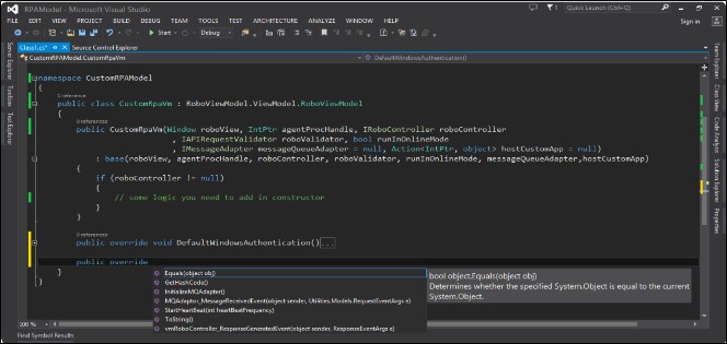
- Derive the new custom class from the RoboViewModel.ViewModel.RoboViewModel class.
- Write a constructor to this custom class and pass the respective parameters to the base class.
- Once done, override the below methods as per the business requirement.
- StartHeartBeat: This generates the robot and sends a heartbeat.
- InitializeMQAdapter: This method initializes the connections with the message queues.
- MQAdaptor_MessageReceivedEvent: This method is attached to the message queues received event.
- vmRoboController_ResponseGeneratedEvent: This method generates response event raised attached to the RoboController’s response completed.
Code snippet:
- Build this custom robot view model.
- In the RoboView project, add this newly created custom robot view model dll. Add the RobotViewModel DLL.
- In the RView constructor, create the instance of this newly created custom robo view model class with the respective param- eters and assign it to datacontext of RoboView project.
Below is the code snippet of the custom robot view model.

Customize Robot SE UI
- Create a new WPF application project in Visual studio.
- Copy the “App.config” from default Roboview project to this newly created project.
- Add ‘Robocommands.html’ and’Robocommands.xml’ files to the project.
- Add Configurations folder to the project and below files to the configurations folder.
- MQConfiguration.xml
- RobotDetails.xml
- Add Images folder to the project and below files to the images folder.
- ev_logo_woInfy.png
- logo.gif
- top_left_close_btn.png
- Add references to following DLLs:
- RobotViewModel.dll
- UIAutomationProvider.dll
- Utilities.AppSettingsManager.dll
- Utilities.CustomMessageBox.dll
- Utilities.Interfaces.dll
- Create the required view in MainWindow.xaml or customize the default view xaml.
- Xaml for the default view:
Window x:Class=”RoboView.RView” xmlns=”http://schemas.microsoft.com/winfx/2006/xaml/presentation” xmlns:x=”http://schemas.microsoft.com/winfx/2006/xaml”
Height=”530” Width=”700” ResizeMode=”CanMinimize” WindowStartupLocation=”CenterScreen” Title=”{Binding RoboModel.RoboInstanceName}”>
<Window.Resources>
<Style TargetType=”{x:Type TextBlock}”>
<Setter Property=”FontSize” Value=”12”/>
<Setter Property=”FontFamily” Value=”Arial”/>
<Setter Property=”FontWeight” Value=”Regular”/>
<Setter Property=”Foreground” Value=”Black”/>
</Style>
<Style TargetType=”{x:Type TextBlock}” x:Key=”TextBlockContentWithoutFG”>
<Setter Property=”FontSize” Value=”12”/>
<Setter Property=”FontFamily” Value=”Arial”/>
<Setter Property=”FontWeight” Value=”Regular”/>
</Style>
<Style TargetType=”{x:Type TextBlock}” x:Key=”TextBlockWithFG”>
<Setter Property=”FontSize” Value=”12”/>
<Setter Property=”FontFamily” Value=”Arial”/>
<Setter Property=”FontWeight” Value=”Bold”/>
<Setter Property=”Foreground” Value=”#333333”/>
</Style>
<Style TargetType=”ListViewItem”>
<Setter Property=”HorizontalContentAlignment” Value=”Stretch” />
</Style>
<Style x:Key=”SignInButton” TargetType=”{x:Type Button}”>
<Setter Property=”Background” Value=”{DynamicResource SearchButtonBackGroundColor}”/>
<Setter Property=”Template”>
<Setter.Value>
<ControlTemplate TargetType=”{x:Type Button}”>
<Grid x:Name=”Grid”>
<Border x:Name=”Background” Background=”{TemplateBinding Background}” CornerRadius=”1” />
<TextBlock HorizontalAlignment=”{TemplateBinding HorizontalContentAlignment}” Text=”{TemplateBinding Content}” x:Name=”ContentText” Margin=”{TemplateBinding Padding}” VerticalAlignment=”{TemplateBinding VerticalConten- tAlignment}”
Style=”{DynamicResource TextBlockContentWithoutFG}” Foreground=”{DynamicResource WhiteColorBrush}” />
</Grid>
<ControlTemplate.Triggers>
<Trigger Property=”IsMouseOver” Value=”true”>
<Setter TargetName=”Background” Property=”Background” Value=”{DynamicResource SearchButtonHoverCol-
or}”>
</Setter>
<Setter Property=”Cursor” Value=”Hand”/>
</Trigger>
<Trigger Property=”IsEnabled” Value=”false”>
<Setter TargetName=”Background” Property=”Background” Value=”Gray”>
</Setter>
</Trigger>
<MultiTrigger>
<MultiTrigger.Conditions>
<Condition Property=”Content” Value=”Search”/>
<Condition Property=”IsMouseOver” Value=”false”/>
</MultiTrigger.Conditions>
<Setter TargetName=”Background” Property=”Background” Value=”{DynamicResource SearchButton}”>
</Setter>
<Setter Property=”Cursor” Value=”Hand”/>
</MultiTrigger>
</ControlTemplate.Triggers>
</ControlTemplate>
</Setter.Value>
</Setter>
</Style>
<Style x:Key=”JsonCommandButtons” TargetType=”{x:Type Button}”>
<Setter Property=”Background” Value=”White”/>
<Setter Property=”Template”>
<Setter.Value>
<ControlTemplate TargetType=”{x:Type Button}”>
<Border x:Name=”border”>
<Grid x:Name=”Grid”>
<Border x:Name=”Background” Background=”{TemplateBinding Background}” CornerRadius=”1” />
<TextBlock HorizontalAlignment=”{TemplateBinding HorizontalContentAlignment}” Text=”{TemplateBinding Content}” x:Name=”ContentText” Margin=”{TemplateBinding Padding}” VerticalAlignment=”{TemplateBinding VerticalConten- tAlignment}”
Style=”{DynamicResource TextBlockContentWithoutFG}” Foreground=”#788288” />
</Grid>
</Border>
<ControlTemplate.Triggers>
<Trigger Property=”IsMouseOver” Value=”true”>
<Setter TargetName=”border” Property=”BorderBrush” Value=”{DynamicResource SearchButtonHoverColor}” />
<Setter TargetName=”border” Property=”BorderThickness” Value=”0,0,0,2” />
<Setter TargetName=”ContentText” Property=”Foreground” Value=”{DynamicResource SearchButtonHoverColor}” />
<Setter Property=”Cursor” Value=”Hand”/>
</Trigger>
<Trigger Property=”IsEnabled” Value=”false”>
<Setter TargetName=”Background” Property=”Background” Value=”Gray”>
</Setter>
</Trigger>
<MultiTrigger>
<MultiTrigger.Conditions>
<Condition Property=”Content” Value=”Search”/>
<Condition Property=”IsMouseOver” Value=”false”/>
</MultiTrigger.Conditions>
<Setter TargetName=”Background” Property=”Background” Value=”{DynamicResource SearchButton}”>
</Setter>
<Setter Property=”Cursor” Value=”Hand”/>
</MultiTrigger>
</ControlTemplate.Triggers>
</ControlTemplate>
</Setter.Value>
</Setter>
</Style>
<Style x:Key=”CircularButton” TargetType=”{x:Type Button}”>
<Setter Property=”Background” Value=”White”/>
<Setter Property=”Template”>
<Setter.Value>
<ControlTemplate TargetType=”{x:Type Button}”>
<Border x:Name=”border” Background=”White” BorderBrush=”Gray” BorderThickness=”1” CornerRadius=”10”>
<Grid x:Name=”Grid” Margin=”3,2,3,2”>
<Border x:Name=”Background” Background=”{TemplateBinding Background}” CornerRadius=”1” />
<TextBlock HorizontalAlignment=”{TemplateBinding HorizontalContentAlignment}” Text=”{TemplateBinding Content}” x:Name=”ContentText” Margin=”{TemplateBinding Padding}” VerticalAlignment=”{TemplateBinding VerticalContentAlignment}”
Style=”{DynamicResource TextBlockContentWithoutFG}” Foreground=”#788288” />
</Grid>
</Border>
<ControlTemplate.Triggers>
<Trigger Property=”IsMouseOver” Value=”true”>
<Setter Property=”Cursor” Value=”Hand”/>
</Trigger>
<Trigger Property=”IsEnabled” Value=”false”>
<Setter TargetName=”Background” Property=”Background” Value=”Gray”>
</Setter>
</Trigger>
<MultiTrigger>
<MultiTrigger.Conditions>
<Condition Property=”Content” Value=”Search”/>
<Condition Property=”IsMouseOver” Value=”false”/>
</MultiTrigger.Conditions>
<Setter TargetName=”Background” Property=”Background” Value=”{DynamicResource SearchButton}”>
</Setter>
<Setter Property=”Cursor” Value=”Hand”/>
</MultiTrigger>
</ControlTemplate.Triggers>
</ControlTemplate>
</Setter.Value>
</Setter>
</Style>
<Style TargetType=”{x:Type TabControl}”>
<Setter Property=”OverridesDefaultStyle” Value=”True” />
<Setter Property=”SnapsToDevicePixels” Value=”True” />
<Setter Property=”Template”>
<Setter.Value>
<ControlTemplate TargetType=”{x:Type TabControl}”>
<Grid KeyboardNavigation.TabNavigation=”Local”>
<Grid.RowDefinitions>
<RowDefinition Height=”Auto”/>
<RowDefinition Height=”*”/>
</Grid.RowDefinitions>
<!-- This inserts the button -> -->
<Grid>
<Grid.ColumnDefinitions>
<ColumnDefinition Width=”*”/>
<ColumnDefinition Width=”Auto”/>
</Grid.ColumnDefinitions>
<Button x:Name=”btnAbout” Grid.Column=”1” Click=”btnAbout_Click” BorderBrush=”Transparent” Padding=”5” Margin=”0,0,15,0” Background=”#008ED2” >
<TextBlock Text=”About” Foreground=”White” FontWeight=”Normal” />
</Button>
<TabPanel Name=”HeaderPanel” Panel.ZIndex=”1” Margin=”0,0,4,-1”
IsItemsHost=”True” KeyboardNavigation.TabIndex=”1”
Background=”Transparent” />
</Grid>
<!-- <- This inserts the button -->
<Border Name=”Border” Grid.Row=”1” BorderThickness=”1” CornerRadius=”2”
KeyboardNavigation.TabNavigation=”Local” KeyboardNavigation.DirectionalNavigation=”Contained” KeyboardNavigation.TabIndex=”2” >
<ContentPresenter Name=”PART_SelectedContentHost” Margin=”4”
ContentSource=”SelectedContent” />
</Border>
</Grid>
</ControlTemplate>
</Setter.Value>
</Setter>
</Style>
</Window.Resources>
<StackPanel HorizontalAlignment=”Left” Orientation=”Vertical” VerticalAlignment=”Top” Height=”520” Width=”690”>
<TabControl x:Name=”menuTab” TabStripPlacement=”Top” BorderThickness=”0” Height=”468” HorizontalAlignment=”Left” Width=”690” Background=”#EAECF0”>
<TabControl.Resources>
<Style TargetType=”TabItem”>
<Setter Property=”Template”>
<Setter.Value>
<ControlTemplate TargetType=”TabItem”>
<!--<Border Name=”Border”>-->
<Grid Name=”Panel” >
<ContentPresenter x:Name=”ContentSite” VerticalAlignment=”Stretch”
HorizontalAlignment=”Stretch” ContentSource=”Header”
Margin=”10,5,10,5” />
</Grid>
<!--</Border>-->
<ControlTemplate.Triggers>
<Trigger Property=”IsSelected” Value=”False”>
<Setter TargetName=”Panel” Property=”Background” Value=”white” />
<Setter Property=”Foreground” Value=”#666666” />
</Trigger>
<Trigger Property=”IsSelected” Value=”True”>
<Setter TargetName=”Panel” Property=”Background” Value=”#008ED2” />
<Setter Property=”Foreground” Value=”White” />
</Trigger>
</ControlTemplate.Triggers>
</ControlTemplate>
</Setter.Value>
</Setter>
</Style>
</TabControl.Resources>
<TabItem x:Name=”commandConsoleMenu” VerticalContentAlignment=”Stretch” Header=”Command Console” DataCon- text=”{Binding RoboModel.CommandConsole}” >
<StackPanel>
<DockPanel LastChildFill=”True” Margin=”20,5,5,5” HorizontalAlignment=”Left” Width=”650”>
<TextBlock Margin=”2” Text=”User Name : “ FontWeight=”Bold”/>
<TextBlock Margin=”2” Text=”{Binding UserName}”/>
<TextBlock Margin=”2” Text=” Profile(s) : “ FontWeight=”Bold”/>
<TextBlock Margin=”2” Text=”{Binding ProfileName}”/>
<Button Name=”help” Content=”?” ToolTip=”Help” BorderBrush=”Transparent” Width=”20” Horizonta- lAlignment=”Right” Style=”{DynamicResource CircularButton}” Command=”{Binding ExecuteHelpCommand}” DockPanel. Dock=”Right” ></Button>
</DockPanel>
<!--</Border>-->
<Grid Margin=”0,0,-8,-13”>
<Grid.ColumnDefinitions>
<ColumnDefinition Width=”347*”/>
<ColumnDefinition Width=”312*”/>
<ColumnDefinition Width=”35*”/>
</Grid.ColumnDefinitions>
<Border Height=”380” VerticalAlignment=”Stretch” BorderThickness=”1,1,1,3” Margin=”10,0,10,5” Border- Brush=”#D5D7DA”>
<Grid Background=”White”>
<Grid.RowDefinitions>
<RowDefinition Height=”Auto” />
<RowDefinition Height=”*” />
<RowDefinition Height=”Auto” />
</Grid.RowDefinitions>
<StackPanel Orientation=”Horizontal”>
<Button x:Name=”DoAuthenticate” Content=”Authenticate” Padding=”10,7,10,7” VerticalAlignment=”Bot- tom” Style=”{DynamicResource JsonCommandButtons}” Command=”{Binding GetJsonCommand}” CommandParameter=”{Bind- ing RelativeSource={RelativeSource Mode=Self}}”/>
<Button x:Name=”DoSignIn” Content=”SignIn” Padding=”10,7,10,7” VerticalAlignment=”Bottom” Style=”{- DynamicResource JsonCommandButtons}” Command=”{Binding GetJsonCommand}” CommandParameter=”{Binding Relative- Source={RelativeSource Mode=Self}}” Grid.ColumnSpan=”3” RenderTransformOrigin=”0.944,0.649”/>
<Button x:Name=”DoSearch” Content=”Search” Padding=”10,7,10,7” VerticalAlignment=”Bottom” Style=”{DynamicResource JsonCommandButtons}” Command=”{Binding GetJsonCommand}” CommandParameter=”{Binding RelativeSource={RelativeSource Mode=Self}}” Grid.Column=”3”/>
</StackPanel>
<DockPanel Grid.Row=”1” Margin=”20,5,20,10”>
<TextBlock x:Name=”commandLabel” Text=”Enter Json code here” Margin=”-1,10,0,5” Style=”{DynamicRe- source TextBlockWithFG}” DockPanel.Dock=”Top” HorizontalAlignment=”Left”/>
<TextBox x:Name=”commandToExecute” MinLines=”8” TextWrapping=”Wrap” BorderBrush=”#999999” ScrollViewer.VerticalScrollBarVisibility=”Auto” Text=”{Binding CommandToExecute, Mode=TwoWay, UpdateSourceTrigger=Prop- ertyChanged}”>
<TextBox.InputBindings>
<KeyBinding Command=”{Binding FormatJsonCommand}” CommandParameter=”{Binding Text, Ele- mentName=commandToExecute}” Key=”Enter” Modifiers=”Control”></KeyBinding>
</TextBox.InputBindings>
</TextBox>
</DockPanel>
<StackPanel HorizontalAlignment=”Right” Grid.Row=”2” Margin=”0,5,20,10” >
<Button x:Name=”execute” Content=”Execute >” Padding=”10,5,10,5” VerticalAlignment=”Bottom” Style=”{DynamicResource SignInButton}” Command=”{Binding ExecuteJsonCommand}” Grid.Column=”3” IsEnabled=”{Binding IsExecuteButtonEnabled}”/>
</StackPanel>
</Grid>
</Border>
<Border Height=”380” Grid.Column=”1” VerticalAlignment=”Stretch” BorderThickness=”1,1,1,3” Mar- gin=”0,0,25,5” BorderBrush=”#D5D7DA” Grid.ColumnSpan=”2”>
<Grid Background=”White”>
<Grid.RowDefinitions>
<RowDefinition Height=”Auto” />
<RowDefinition Height=”*” />
</Grid.RowDefinitions>
<TextBlock x:Name=”resultLabel” Margin=”20,10,20,5” Text=”Responses” Style=”{DynamicResource TextBlock- WithFG}” HorizontalAlignment=”Left”/>
<TextBox x:Name=”commandResult” Margin=”20,5,15,10” MinLines=”8” Grid.Row=”1” TextWrapping=”Wrap” ScrollViewer.VerticalScrollBarVisibility=”Auto” ScrollViewer.HorizontalScrollBarVisibility=”Auto” Text=”{Binding CommandResult, Mode=TwoWay, UpdateSourceTrigger=PropertyChanged}”/>
</Grid>
</Border>
</Grid>
</StackPanel>
</TabItem>
<TabItem Name=”dashBoardMenu” Header=”Dashboard” >
<Grid>
<Grid.RowDefinitions>
<RowDefinition Height=”Auto”/>
<RowDefinition Height=”Auto”/>
<RowDefinition/>
</Grid.RowDefinitions>
<WrapPanel Grid.Row=”0” Orientation=”Horizontal” Margin=”20,5,5,5” HorizontalAlignment=”Left”>
<TextBlock Margin=”2” Text=”ServerName : “ FontWeight=”Bold”/>
<TextBlock Margin=”2” Text=”{Binding ServerName}”/>
<TextBlock Margin=”2” Text=” Port : “ FontWeight=”Bold”/>
<TextBlock Margin=”2” Text=”{Binding PortNumber}”/>
<TextBlock Margin=”2” Text=” Status : “ FontWeight=”Bold”/>
<Ellipse x:Name=”elpsConnectionStatus” Width=”15” Height=”15” HorizontalAlignment=”Left”>
<Ellipse.Style>
<Style TargetType=”Ellipse”>
<Setter Property=”Fill” Value=”Red” />
<Style.Triggers>
<DataTrigger Binding=”{Binding MQAdapter.IsConnected}” Value=”True”>
<Setter Property=”Fill” Value=”Green” />
</DataTrigger>
</Style.Triggers>
</Style>
</Ellipse.Style>
</Ellipse>
<TextBlock Margin=”2” Text=” Subscribed : “ FontWeight=”Bold”/>
<Ellipse x:Name=”elpsSubscribedStatus” Width=”15” Height=”15” HorizontalAlignment=”Left”>
<Ellipse.Style>
<Style TargetType=”Ellipse”>
<Setter Property=”Fill” Value=”Red” />
<Style.Triggers>
<DataTrigger Binding=”{Binding MQAdapter.IsSQConnectionExists}” Value=”True”>
<Setter Property=”Fill” Value=”Green” />
</DataTrigger>
</Style.Triggers>
</Style>
</Ellipse.Style>
</Ellipse>
</WrapPanel>
<Grid Margin=”0,0,0,0” Grid.Row=”2”>
<Grid.ColumnDefinitions>
<ColumnDefinition Width=”20”/>
<ColumnDefinition Width=”23*” />
<ColumnDefinition Width=”36*”/>
<ColumnDefinition Width=”254*”/>
<ColumnDefinition Width=”20”/>
<ColumnDefinition Width=”313*” />
<ColumnDefinition Width=”20”/>
</Grid.ColumnDefinitions>
<Grid.RowDefinitions>
<RowDefinition Height=”30”/>
<RowDefinition Height=”3*” />
<RowDefinition Height=”25”/>
<RowDefinition Height=”2*” />
<RowDefinition Height=”7”/>
</Grid.RowDefinitions>
<Button x:Name=”btnTransaction” Width=”150” Height=”20” Grid.Column=”1” Grid.Row=”0” x:Uid=”Transaction” Content=”Show Transaction” HorizontalAlignment=”Left” Margin=”0,10,0,0”
Command=”{Binding RoboDashboardModel.DashBoardRequestCommand}” CommandParameter=”{Binding Uid, Relativ- Source={RelativeSource Self}}” Grid.ColumnSpan=”3” Style=”{DynamicResource SignInButton}” />
<Button x:Name=”btnRequestResponse” x:Uid=”RequestResponse” Width=”150” Height=”20” Grid.Column=”3” Grid.Row=”0” Content=”Show Request/Response” Margin=”106,10,18,0”
Command=”{Binding RoboDashboardModel.DashBoardRequestCommand}” CommandParameter=”{Binding Uid, Relative- Source={RelativeSource Self}}” Style=”{DynamicResource SignInButton}” Grid.ColumnSpan=”2” />
<Button x:Name=”btnRoboConfiguration” Content=”Robot Details” Height=”20” HorizontalAlignment=”Right” Margin=”0,10,165,0” Width=”150” Grid.Column=”4” Command=”{Binding RoboDashboardModel.ShowRobotDetailsCommand}”
Style=”{DynamicResource SignInButton}” Grid.ColumnSpan=”2” />
<Button x:Name=”btnShowLog” Grid.Row=”0” Grid.Column=”5” Width=”150” Height=”20” Content=”View Log File” HorizontalAlignment=”Right” VerticalAlignment=”Center”
Command=”{Binding RoboDashboardModel.ShowLogFileCommand}” Margin=”0,10,0,0” Style=”{DynamicResource SignInButton}”/>
<Grid Background=”White” Grid.ColumnSpan=”5” Margin=”0,10” Grid.Column=”1” Grid.Row=”1” Grid.RowSpan=”2”>
<ListBox x:Name=”lb” AlternationCount=”2” IsTextSearchEnabled=”True” ScrollViewer.HorizontalScrollBarVisibili- ty=”Disabled”
ItemsSource=”{Binding RoboDashboardModel.DashBoardBindedDataSource}” SelectionMode=”Multiple” SelectedItem=”{Bind- ing RoboDashboardModel.DashboardSelectedValue}” Margin=”10”>
<ListBox.ItemTemplate>
<DataTemplate>
<TextBlock Text=”{Binding}” TextWrapping=”Wrap”/>
</DataTemplate>
</ListBox.ItemTemplate>
<ListBox.ContextMenu>
<ContextMenu>
<MenuItem Header=”Copy” Command=”{Binding RoboDashboardModel.CopyDashboardContentCommand}”/>
</ContextMenu>
</ListBox.ContextMenu>
</ListBox>
</Grid>
<TextBlock x:Name=”lblRobotStatus” Text=”Robot Status” Margin=”0,9,0,114” Style=”{DynamicResource Text- BlockWithFG}” DockPanel.Dock=”Top” HorizontalAlignment=”Left” Grid.ColumnSpan=”2” Grid.Column=”2” Grid.Row=”3”/>
<Grid Background=”White” Grid.Column=”1” Margin=”3,29,0,3” Grid.Row=”3” Grid.ColumnSpan=”5”>
<ListBox x:Name=”lstBoxRobotStatus”
ItemsSource=”{Binding RoboDashboardModel.RobotStatus}” Margin=”10,11,9,7” >
<ListBox.ItemTemplate>
<DataTemplate>
<Grid>
<Grid.ColumnDefinitions>
<ColumnDefinition Width=”*” SharedSizeGroup=”Key” />
<ColumnDefinition Width=”*” SharedSizeGroup=”Name” />
</Grid.ColumnDefinitions>
<TextBlock Margin=”2” Text=”{Binding Key}” Grid.Column=”0”/>
<TextBlock Margin=”2” Text=”{Binding Value}” Grid.Column=”1”/>
</Grid>
</DataTemplate>
</ListBox.ItemTemplate>
</ListBox>
</Grid>
</Grid>
</Grid>
</TabItem>
</TabControl>
<DockPanel Style=”{DynamicResource CopyrightDockpanelStyle}” >
<DockPanel HorizontalAlignment=”Left” Margin=”5,0,0,0” Width=”auto” Grid.Column=”0” Background=”{DynamicRe- source CopyrightDockpanelBackground}”>
<Label Style=”{DynamicResource LabelContentWithoutFG}” Foreground=”{DynamicResource SignInFGColor}” VerticalAlignment=”Bottom” HorizontalAlignment=”Left” Content=”{DynamicResource SignIn_Footer_CopyRightMsg}” />
</DockPanel>
<DockPanel Width=”213” HorizontalAlignment=”Right” Margin=”0,0,10,0” Grid.Column=”2” Background=”{DynamicRe- source CopyrightDockpanelBackground}”>
<Image Source=”Images/ev_logo_woInfy.png” Height=”18” Width=”213” HorizontalAlignment=”Right” />
</DockPanel>
</DockPanel>
<Grid Name=”CustomAppHost”>
</Grid>
</StackPanel>
</Window>
- Code of the default view:
{
RoboViewModel.ViewModel.RoboViewModel roboViewModel; public RView()
{
InitializeComponent();
// TODO: default value must be false when in production bool runInOnlineMode = false;
IntPtr agentProcHandle = IntPtr.Zero;
// application start up arguments string[0] will have property for running Robot in Online or Offline mode var appStartupArgs = (Application.Current as App).StartupArgs;
if (appStartupArgs != null && appStartupArgs.Length > 0)
{
// expecting first argument as online mode from agent while Robot launch -Not Mandatory if(appStartupArgs[0].ToLower() == “online”)
{
runInOnlineMode = true;
}
// expecting agent processid as second parameter -Not Mandatory
if (appStartupArgs.Length > 1 && !string.IsNullOrEmpty(appStartupArgs[1]))
{
agentProcHandle = ((IntPtr)Convert.ToInt32(appStartupArgs[1].ToString()));
}
}
roboViewModel = new RoboViewModel.ViewModel.RoboViewModel(this, agentProcHandle, null, null, runInOnlineMode, null, HostCustomApp);
this.DataContext = roboViewModel;
#region in case of custom RoboView Model
/*
CustomRPAModel.CustomRpaVm roboViewModel = new CustomRPAModel.CustomRpaVm(this, agentProcHandle, null, null, runInOnlineMode,
null, HostCustomApp); this.DataContext = roboViewModel;
*/
#endregion
string evLogoPath = CustomNameValueCollection.GetInstance(“PrimarySettings/IODiskPaths”)[“EVLogoPath”].ToString(); this.Icon = new BitmapImage(new Uri(evLogoPath, UriKind.Relative));
}
private void TabPanelButton_Click(object sender, RoutedEventArgs e)
{
}
private void btnAbout_Click(object sender, RoutedEventArgs e)
{
string ProductName = CustomNameValueCollection.GetInstance(“PrimarySettings/Parameters”)[“ProductName”].To- String();
string VersionName = CustomNameValueCollection.GetInstance(“PrimarySettings/Parameters”)[“VersionName”].To- String();
string ReleaseYear = CustomNameValueCollection.GetInstance(“PrimarySettings/Parameters”)[“ReleaseYear”].ToString();
CustomMessageBox.ShowAbout(ProductName, ReleaseYear, VersionName);
}
public void HostCustomApp(IntPtr appHandle, object controlToHost)
{
WindowsFormsHost winFormHost = new WindowsFormsHost(); if (controlToHost != null)
{
winFormHost.Child = (System.Windows.Forms.Control)controlToHost; CustomAppHost.Children.Add(winFormHost);
}
}
}
- Public properties available for binding on custom view are highlighted in yellow in the default xaml provided above:
RoboModel.CommandConsole: This property is the Command Console Tab model.
Public string CommandToExecute: takes the JSON commands as inputs for respective RPA BL (RPA Business Layer) API.
Public ICommand ExecuteJsonCommand: Executes the RPA BL APIs.
Public ICommand ExecuteHelpCommand: Refer to the ‘Robocommands.html’ document.
Public string CommandResult: response received from the respective RPA BL API.
Public ICommand DashBoardRequestCommand: This is for Transaction or Request Response.
Public ICommand ShowLogFileCommand: opens up the latest RPA log file.
ObservableDictionary<string, string> RobotStatus: Displays the RPA Robot status.
RoboDashboardModel.ShowRobotDetailsCommand: Displays the Robot Details in message box.
UserName: Logged in User Name.
ProfileName: Profile with which user is signed in.
RelayCommand<object> GetJsonCommand: returns specific JSON command from Robocommands.xml.
RelayCommand<object> FormatJsonCommand: returns the text in the correct JSON format.
bool IsExecuteButtonEnabled: defines IsEnabled property of the Execute button.
MQAdapter.IsConnected: This flag indicates if the Robot is connected to MQ Adapter.
MQAdapter.IsSQConnectionExists: This flag indicates if the connection still exists.
RoboDashboardModel.DashBoardBindedDataSource: This returns the Transaction or Request/Response data based on the selected input.